As a Retirement Planner, each year I eagerly await the release of J.P. Morgan’s Guide to Retirement. It is essentially a booklet of retirement charts filled with great information impacting retirees. Making it even better, it often highlights things that are regularly overlooked by just about anyone (including professionals) planning for retirement today. With that in mind, I have selected 10 charts that I think everyone transitioning into retirement should see with a little commentary on each. Every chart comes directly from their guide and credit for each chart’s information is provided within the guide itself.
1. Life Expectancy Probabilities
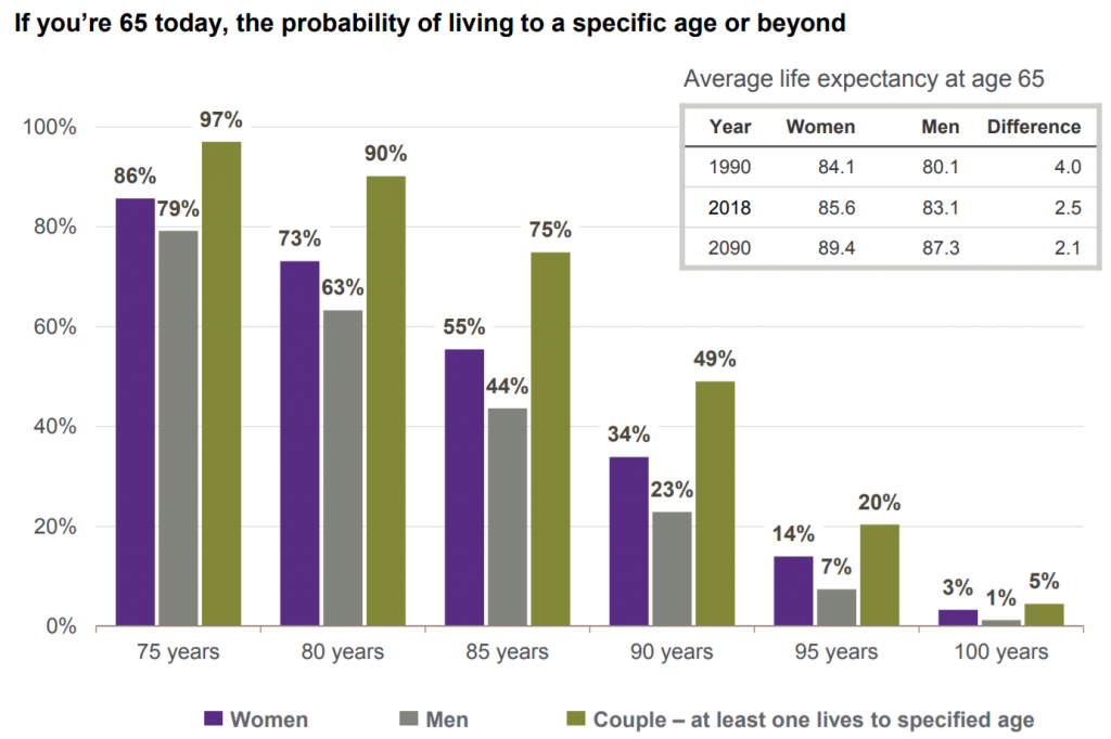
When asked how long they’ll live, many retirees will respond late 70s or early 80s. Not all that surprising considering the average life expectancy for the average man and woman is 83 and 85 respectively. However, that ignores the average joint life expectancy of approximately 90 years old for 49% of the population and the 20% that live to age 95.
But what makes their estimates even less likely to be accurate is that we must remember these are averages! I’ll bet that if you are reading this site that you are not average. You’ve likely made above-average income, had above average healthcare, lived a less physically demanding life and concurrently eaten a healthier overall diet. If that’s true, then you are likely to be on the high side of all of the above estimates. That being the case, imagine what your portfolio will need to do to maintain your standard of living over a 25 or 30 plus year retirement.
2020 Update: The average life expectancy from 2017 to 2018 decreased by 0.1 for folks turning age 65 in 2018 versus 2017.
Related reading: Retirees Underestimate the Impact of Longevity & Inflation
2. Older Americans Are Working Longer
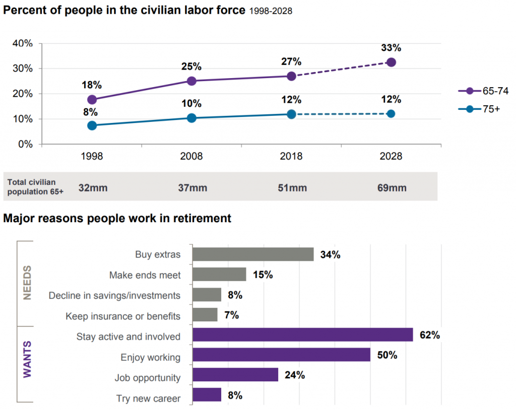
While there are plenty of people that can’t wait to retire, I’m finding more and more people want to keep working. I’ve said before that I have a few clients that have been telling me they are going to retire in “a year or two” for close to a decade. This observation is evident in the data. It appears that the major motivations to continue working later in life are mostly to stay active and simply because they enjoy working.
3. Though Not Everyone Can Keep Working
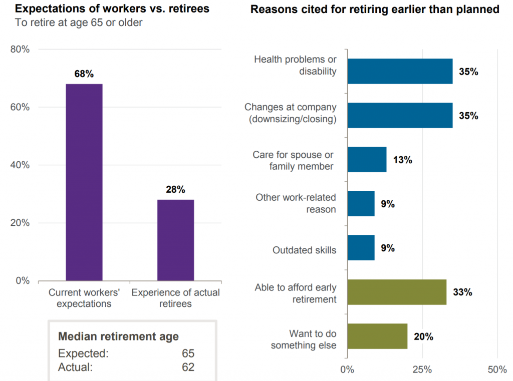
Despite the fact that 68% of workers anticipate retiring at age 65 or older, many are not able to for a variety of reasons. 35% attribute retiring earlier than planned to health problems and another 35% to changes at their company. I’ll be curious to see how these numbers change over the next year due to COVID-19 as many people are being forced out of work. This is why it is probably wise to be prepared financially speaking for retirement earlier than anticipated. I realize that is easier said than done sometimes.
4. Maximizing Social Security - Median Earner
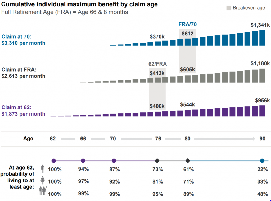
When comparing Social Security claiming strategies, the chart above shows:
In this illustration, the recipient earned $70k per year and retired just prior to turning 62. The Social Security recipient would breakeven around age 76 if they chose to delay claiming until Full Retirement Age versus claiming at age 62. And they would breakeven around age 80 if they chose to delay claiming until age 70 versus Full Retirement Age.
As an FYI, the breakeven age from claiming at age 70 versus claiming at age 62 is approximately 83 years old - not bad when you consider the average joint life expectancy age is almost 90 years old! You would need a strategy to bridge the gap between 62 and 70 if you retire earlier than most.
Related reading: Should You Wait Until 70 For Social Security?
5. Income Replacement Needs in Retirement
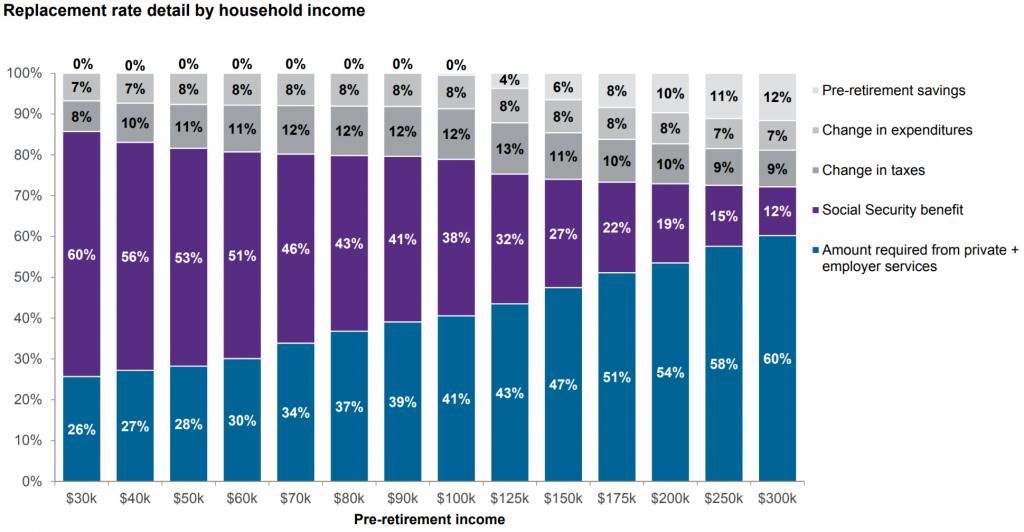
As we can see based on the chart - the more income you make, the less we can expect to receive from Social Security as a percentage of our pre-retirement income. So, obviously, the more you make, the more you will be reliant on your own savings.
One observation I have in working with many retirees though is given that the typical retirement week consists of six Saturdays and a Sunday, I am not sure there is a noticeable difference in pre-retirement spending and post-retirement spending. I think this is especially true early on in retirement when many retirees travel abundantly. If anything they may see an increase in spending.
That said, I still think the replacement rate of 74% could still be accurate given that I would anticipate many people reading this site have above average savings rates which would increase the top-line number they call “Less pre-retirement savings.” If you are saving 20%, 30% or more of your income as many of my clients are, a 74% replacement rate may be pretty accurate if not more than enough.
Related Reading: Why Saving In Your 60s Is So Important - It’s Not the Reason You Think
6. Health Savings Account (HSA) Savings Are Triple-Tax-Advantaged
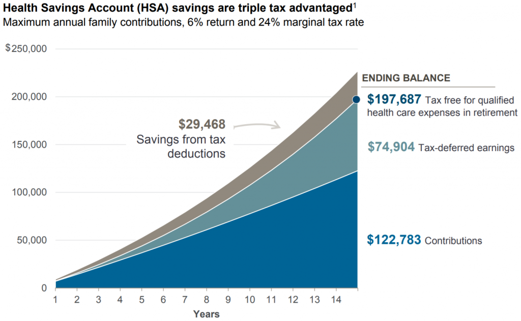
The sheer value of a Health Savings Account from a tax perspective cannot be overstated. There are three primary tax benefits from investing in an HSA:
- Immediate reduction to taxable income (pay less taxes now).
- Tax-deferred growth on your investment.
- Tax-free withdrawals if used for qualified healthcare expenses.
Given this trifecta of tax benefits, if you are participating in a High Deductible Health Plan and financially able to do so, fully funding your HSA is a no-brainer.
7. Average Household Spending By Age & Category
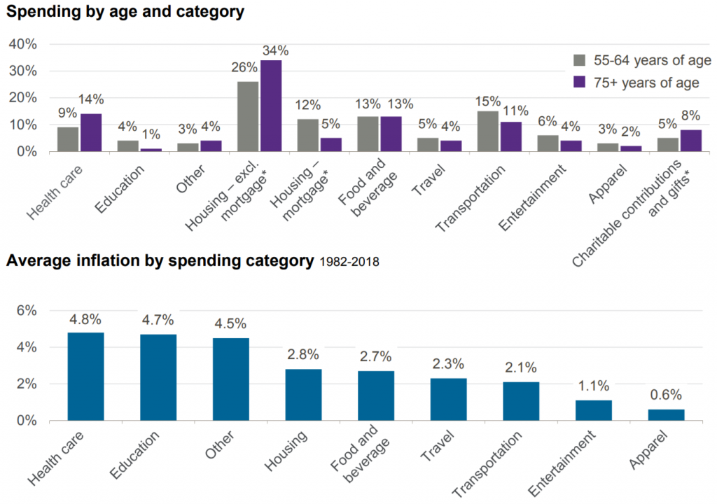
Even as people transition into retirement and continue to age, it’s not all that surprising that as we age, we see a decrease in expenses across a broad range of categories. This is a good example of why spending slightly more at the beginning of retirement isn’t necessarily a bad idea since you are likely to pare down spending over time.
The three areas where we see a noticeable increase in spending over time are health care (no surprise), housing excluding mortgage, and charitable giving.
8. The 4% Rule Sure Seems To Be Spot On Even After All These Years
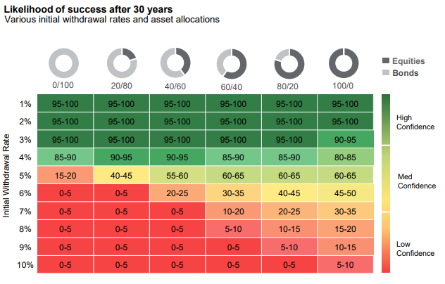
Page 26 of the JP Morgan Guide to Retirement 2019 Edition
This is my favorite visual from the entirety of the Guide to Retirement 2019 edition and they chose not to keep it for 2020. But I am keeping it here since questions about withdrawal rates are very popular. The transition point for sustainable income appears to be right at the 4% withdrawal rate over a 30 year period almost regardless of allocation. Beyond 4%, the retirement waters look a little choppy to me.
That said, there could be an argument for withdrawing a little more in the early years and paring down later. Or an alternative strategy below…
9. Dynamic Spending Can Help Your Money Last Longer
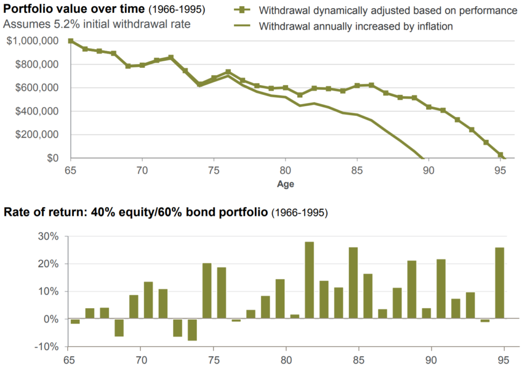
Here are the assumptions for the chart as written on their slide:
Retire at age 65 with $1,000,000 and withdraw 5.2% of the initial portfolio value ($52,000). “Withdrawal annually increased each year by inflation” assumes 3% inflation rate. Dynamic withdrawal scenario assumes that if the annual rate of return on portfolio is: 1) less than 3%, withdrawal remains the same as the prior year. 2) between 3% and 15%, withdrawal is increased by inflation (3%). 3) greater than 15%, withdrawal is increased by 4%. While the dynamic withdrawal scenario during this historical period provided 14% more total spending in today’s dollars, it is for illustrative purposes only and may not be successful during other time periods.
As the data shows, altering spending patterns based on a rules-based market performance approach extended the portfolio’s life by over five years. I really don’t have much to add to their assumptions besides saying that I advocate for a rules-based approach as well and find this strategy compelling. That said, there are a variety of strategies that are viable options to get you through retirement. But just like most everything else with portfolio management, finding a strategy that you can stick with is likely to lead to the best personal results.
10. The Probability of Needing Long Term Care
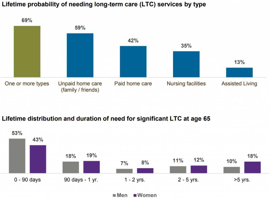
The probability of needing care is extremely high at 69% as indicated in the top chart. But the duration of care needed for about 50% of people is less than 90 days. However, in every length of care required beyond 90 days, women are the likely candidate with almost 1 in 5 women needing care for more than five years which is just staggering to me. It might go without saying, but having a plan to deal with these possibilities is critical.
Related reading: How to Pay for Long-Term Care
If these charts have you interested, I’d encourage you to check out all the retirement charts by going to the actual guide here: J.P. Morgan Guide to Retirement 2020. Making it an even stronger source of retirement information, every chart has the location for the source data, so if you really want to dig in, you can. Enjoy.
Thanks for reading!
Ashby Daniels
If you’re looking for a retirement planner to help you make a comfortable transition into retirement and want to see if we’re a good fit, reach out to me here.
This post is not advice. Please see additional disclaimers.

